Nui Cookies Campaign
For this project, the goal was to create a campaign to help redefine a brand for a different demographic and I decided to do Nui Cookies, a healthy, keto alternative brand to regular cookies.
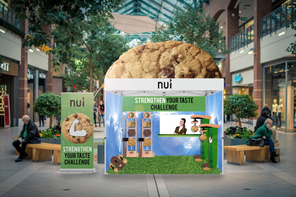
For my project, the main slogan I decided on was “Strengthen Your Taste” and decided to go for a fitness oriented approach, for my pop-up event shown above, people would play strength-oriented games to win cookies as prizes, the higher score they get, the more cookies they could win.
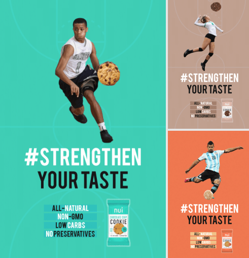
The main focus of the bus shelter ads is the cookie that the players are holding that replaces the ball for the sport they’re playing, this employs the slogan of “Strengthen Your Taste” even further because it makes you associate the cookie with fitness activities which reflects the healthy attributes of the cookies.
City Identity and Way-finding
For this project, the goal was to redesign a city of choice by giving it a new identity while also selecting a certain district inside of it and create a series of way-finding signs.
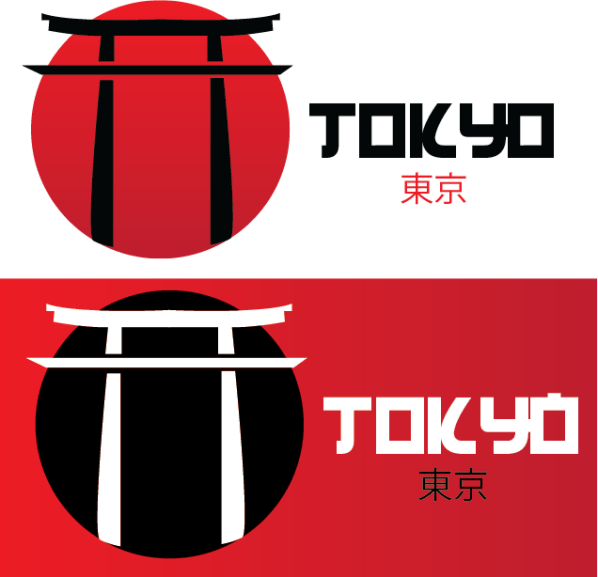
The identity I decided on was a Japanese shrine, looking through various different cultural icons and architecture in Japan I decided that the shrine is the most recognizable out of all of them and would be the most effective approach for a logo.

The location I decided on within Tokyo for my way-finding was Yo-yogi Park. For the basic design, I decided to stick with the red color scheme that I used in the city identity to keep it consistent and incorporated the circle in the background of the flag banner and directional that’s also used in the identity. The type-faces I used are Blowbrush and Japan 3017.
Magazine Project
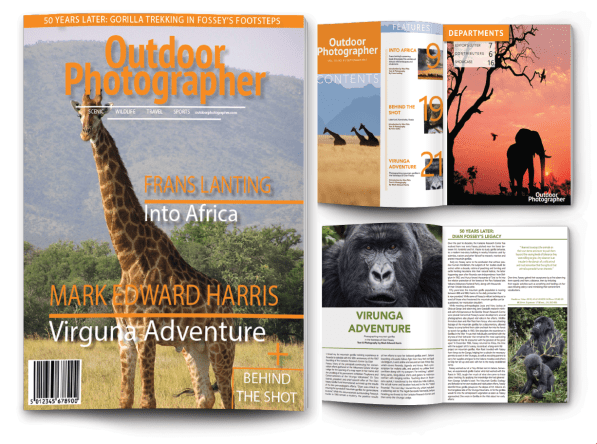
In this project, I decided to redesign the entirety of an issue of the Outdoor Photographer magazine. For the basis of my design, I decided to go for a more modernized look using a cleaner layout for pages and slim, sans serif type-faces.
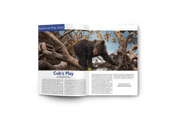
While I used the same orange color-scheme for most of the magazine, the main features each have their own color to make them stand out from each-other.
IMC: Integrated Marketing Campaign
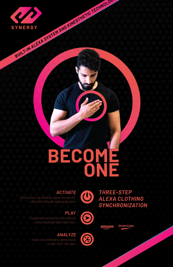
Integrated Marketing Campaign, or in short form, IMC, was a multi-part group project that focused on creating our own smart-clothing product. The name we decided on for our product was Synergy and it would be an accessory that works in conjunction with Amazon Alexa but in a hands-free format for a fitness-oriented audience.
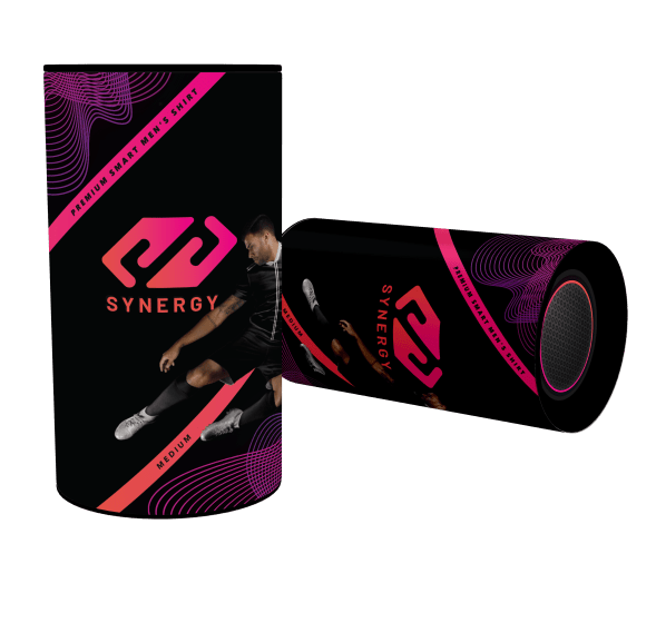
The color scheme we decided on emphasizes a energetic, plasma-like essence which implores our fitness-oriented focus. Continuing on, the tapping gesture shown in the first poster is the main feature of our product and is used as a way to interact with the product.

